
At a Glance
- Android 17 introduces see-through menus that reveal wallpaper and app icons behind them.
- The new blur effect is tied to the user’s Dynamic Color theme.
- The change echoes Apple’s iOS 26 Liquid Glass redesign but is less pronounced.
Why it matters: The new visual style could affect readability and user experience on Android devices.
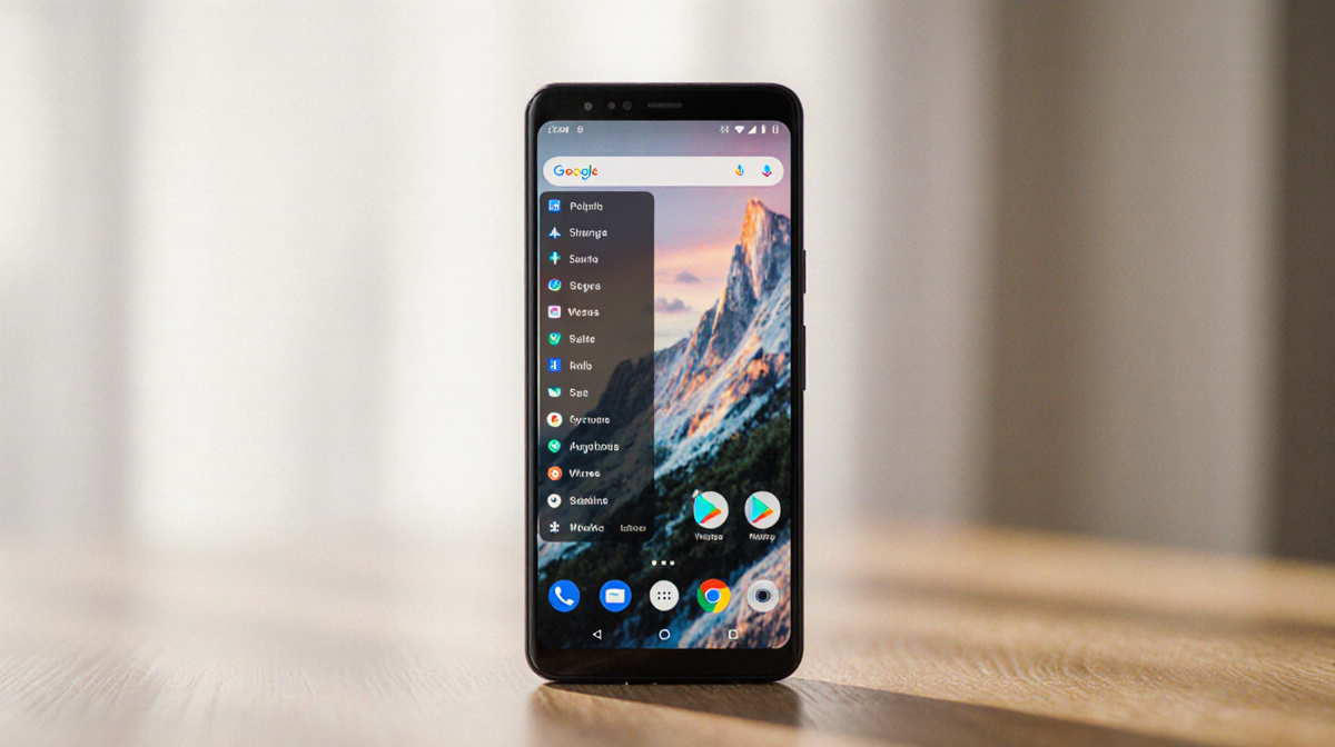
Android 17 is set to bring a new visual layer to the operating system, bringing semi-transparent menus that reveal the background wallpaper and app icons. 9to5Google reports that this change is inspired by Apple’s recent Liquid Glass redesign, but Android’s implementation is smaller in scope.
What’s Changing in Android 17
Android 17 will replace some solid background colors on menus with transparent ones. The new design allows the content behind the menu to be partially visible. 9to5Google notes that this change will affect:
- the volume bar, specifically the pill-shaped container that houses the slider;
- the mode switcher;
- the homescreen menu, where wallpaper and app icons become visible behind the backdrop.
In addition, other system elements such as the volume panel and power menu will also receive a semi-transparent backdrop with a blur effect.
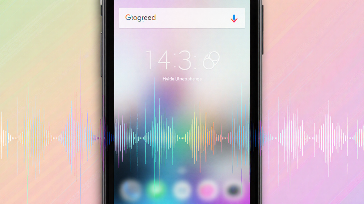
How the Blur Works
The blur intensity is not static. 9to5Google says that the blur level will be influenced by the user’s Dynamic Color theme. Dynamic Color assigns color shades to the UI, and those shades will help determine how much blur is applied. The exact calculation method has not been disclosed.
Impact on UI Elements
| UI Element | Current Appearance | Expected Appearance |
|---|---|---|
| Volume bar | Solid light/dark background | Transparent backdrop with pill-shaped slider container |
| Mode switcher | Solid background | Transparent backdrop |
| Homescreen menu | Solid background | Transparent backdrop revealing wallpaper and apps |
| Volume panel | Solid background | Semi-transparent backdrop with blur |
| Power menu | Solid background | Semi-transparent backdrop with blur |
The design shift may make certain UI components harder to read, especially for users who prefer high contrast or clear boundaries. 9to5Google indicates that the overall visual change is less drastic than Apple’s jump from iOS 18 to iOS 26.
Comparison to iOS Liquid Glass
Apple’s Liquid Glass redesign introduced semi-transparent layers that made the UI feel more fluid. Android’s approach mirrors this idea but keeps the visual change modest. The new Android 17 blur effect does not overhaul the entire system; instead, it targets specific menus and panels.
User Experience Concerns
Users who rely on clear visual separation between elements might find the new blur harder to navigate. 9to5Google notes that while the change is not as extreme as previous Android visual overhauls, it could still require users to adjust.
Some users may need to adapt by:
- Turning on high-contrast mode;
- Adjusting Dynamic Color settings to reduce blur intensity;
- Waiting for future incremental updates that could roll back or refine the effect.
What to Expect Next
9to5Google suggests that the Android 17 visual tweak is likely to be refined over time. If the new blur proves too hard to read, Android may release several incremental updates that roll back or adjust the effect. For now, users will have to wait and see how the new design performs in everyday use.
Key Takeaways
- Android 17 introduces semi-transparent menus that reveal wallpaper and app icons behind them.
- Blur intensity is linked to the user’s Dynamic Color theme.
- The change is inspired by Apple’s Liquid Glass but is less extensive.
- Users may experience reduced legibility and may need to adjust settings or await future updates.
Android’s move toward a more fluid visual style demonstrates the growing influence of design trends across mobile operating systems. Whether the change will be welcomed or met with caution remains to be seen as Android 17 rolls out to devices.